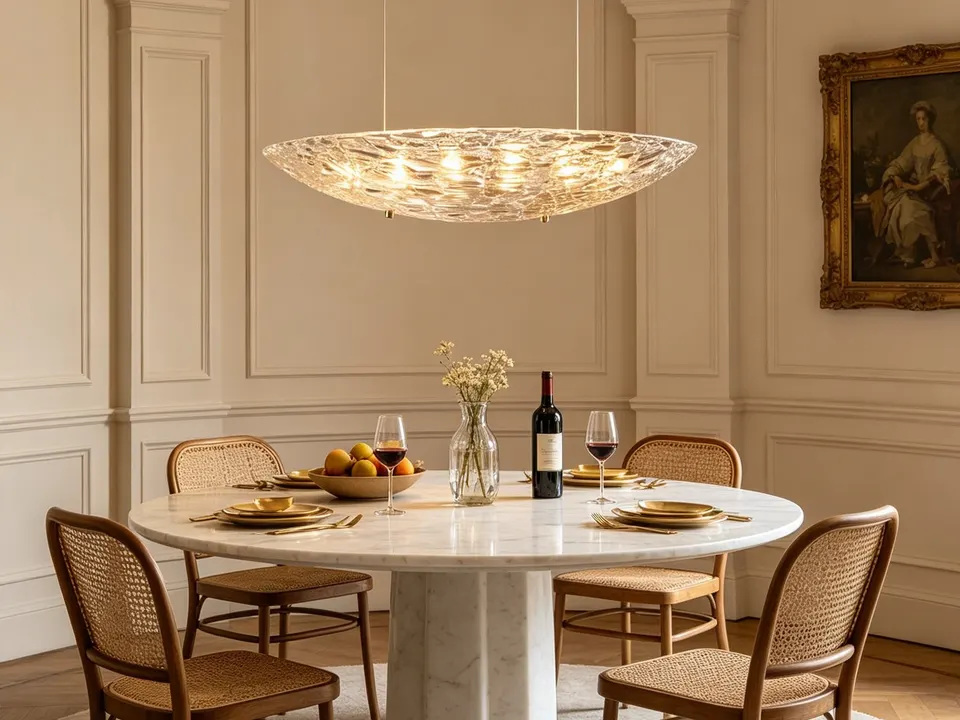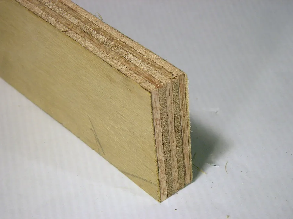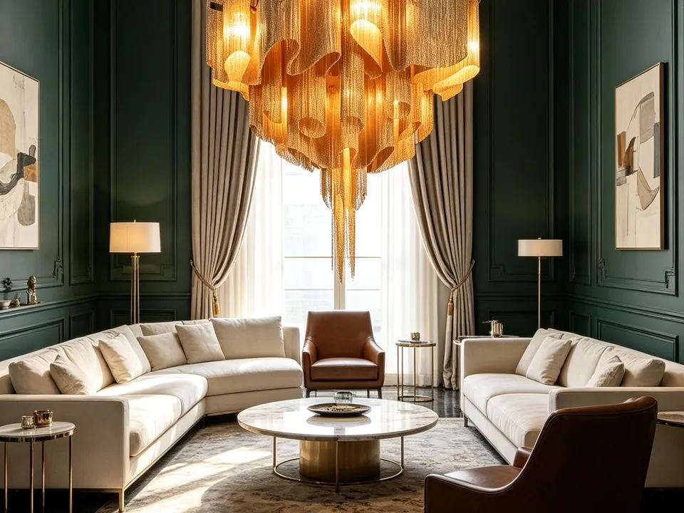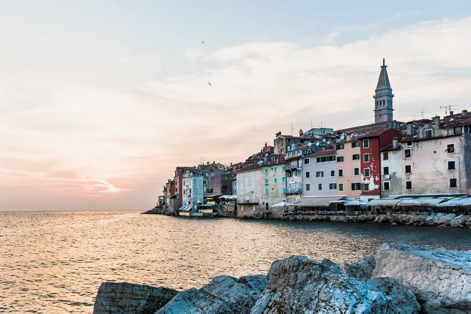
Red earth, white stone, olive leaves, Venetian facades and the sea at dusk. How to turn the colours of Istria into interiors that feel calm in July and warm in January.
Most people who build or buy a house in Istria fall for the place before they fall for the house. They remember the red soil after rain, a hill town turning gold in the evening, the grey-green haze of an olive grove. Then they choose paint from a fan deck under the light of a city showroom and wonder why the house does not feel the same.
The simplest way to choose colours that belong here is to take them from outside the window. Below are five palettes drawn from the Istrian landscape, with notes on where each colour works, and how much of it a room can take.
Why local colours work better
Colour is never seen on its own. It is seen in a particular light and next to particular things. Istrian light is bright and clear for much of the year, and it bounces off pale stone and the sea. Colours that come from the same landscape sit naturally in that light: they look intentional at noon and soft in the evening. Colours borrowed from a different climate, a cool Scandinavian grey or a tropical turquoise, can look flat or harsh here.
There is a practical side too. A house in the countryside sees the view through every window. When the interior palette echoes what is outside, the rooms feel larger and calmer, because the eye does not have to switch between two worlds.
1. Terra rossa: red earth and white stone
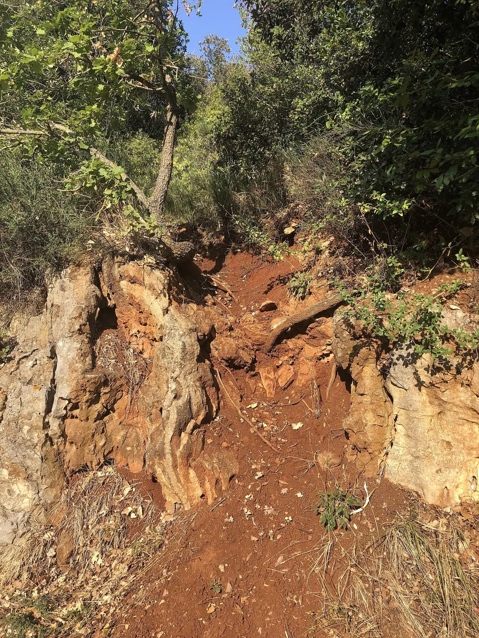
Much of Istria sits on limestone, and the iron-rich soil that forms on it, known as terra rossa, is a deep rusty red. Next to the pale grey and cream of the stone it makes the region's most recognisable contrast, and the soil gives "red Istria" its name, one of three traditional names for the parts of the peninsula, alongside white and grey Istria.
- Base. Warm white or limestone cream on walls and ceilings.
- Accent. Rust, brick and terracotta in floors, cushions, ceramics or a single painted wall.
- Pair with. Mid-tone timber, natural linen, black iron.
- Where. Living rooms and kitchens, especially with terracotta floors.
2. Olive grove: silver green and bark
An olive leaf is two colours: a dusty green on top and silver underneath, which is why a grove seems to flicker in the wind. Add the grey-brown of old bark and the dry grass of late summer, and you have one of the most forgiving palettes there is. It is calm without being cold.
- Base. Soft off-white or a very pale sage.
- Accent. Olive, lichen and grey-green in upholstery, kitchen fronts or shutters.
- Pair with. Pale oak tones, raw linen, stone, brass that is allowed to dull.
- Where. Bedrooms, studies and kitchens that look onto the garden.
3. Venetian facades: ochre, rose and faded green
The coastal towns spent centuries under Venice, and their old centres still show it: tall houses washed in ochre, salmon, dusty pink and pale yellow, with green or brown shutters. The colours are bold on paper but softened by sun and salt, and that softness is the key to using them indoors.
- Base. A warm plaster tone, between cream and pale ochre.
- Accent. Faded rose, apricot or shutter green on doors, a dresser or a bathroom.
- Pair with. White marble or light stone, dark timber, aged gold.
- Where. Town houses, dining rooms, guest bathrooms.
The simplest way to choose colours that belong here is to take them from outside the window.
4. Adriatic: sea blue without the cliché
Blue is the colour everyone expects at the coast, and the one most often overdone. The Adriatic is rarely bright turquoise. Close to shore it is green-blue over pale stone; further out it is a deep, inky blue; at dusk it turns grey and violet. Use those deeper, greyed blues sparingly and let white stone and sand tones do the rest.
- Base. Chalky white or sand.
- Accent. Ink blue or grey-teal in textiles, glass, tiles or a single piece of furniture.
- Pair with. Bleached timber, rope-coloured rugs, white ceramics.
- Where. Bathrooms, bedrooms and rooms that face the sea, where the real thing frames the scheme.
5. Autumn inland: wine, rust and smoke
In autumn, the interior of Istria changes key. Vineyards turn yellow and red, the oak woods of the Mirna valley go bronze, the smoke bush on the hillsides flares crimson, and morning mist sits in the valleys below the hill towns. It is the season of truffles and Teran, and it makes a warm, enveloping palette for rooms used in the cooler months.
- Base. Warm greige or a deep plaster tone.
- Accent. Wine red, rust and bronze in velvet, wool or leather.
- Pair with. Dark timber, amber glass, stone.
- Where. Living rooms with a fireplace, libraries, a winter dining room.
How to use a palette in a real house
A palette is a starting point, not a paint order. A few rules make it work.
- Test on site. Paint large samples on two walls and look at them at noon and at dusk. Istrian light changes colours more than you expect.
- Let materials carry colour. Stone, terracotta, timber and linen bring colour that ages well. Paint is the easiest thing to change later.
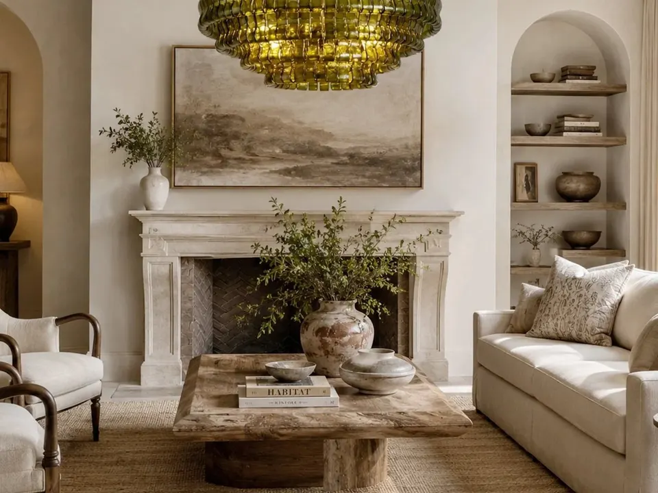
- Go lighter on walls, braver in objects. A rust sofa or a green glass pendant is easier to live with than a rust room.
- Mind the finish. Matt and chalky finishes soften strong colours; gloss makes them harsher in bright light.
- Think about the view. In rooms with a big view, keep the palette quiet and let the window be the colour.
Furniture and lighting are where most of a palette lives day to day. Lampisa, the Istrian atelier we work with, builds furniture to measure in plywood, with the finish chosen to suit the room, and its catalogue includes glass lighting, Murano among it. If you are planning a whole house, the moodboard to render service lets you see the colours together in a 3D render before anything is made. For the bigger picture on style, see our Mediterranean interior guide.